

Logo design: the foundations of a recognisable mark
Archived article with editorially revised content
A logo identifies a business; it does not need to illustrate everything that business does. It may be a wordmark, a symbol or a combination. It works well when it is memorable, distinctive and practical to use.
Do not start with a cliché
A shoe shop does not have to show a shoe, and a technology business does not need a computer in its mark. The brand’s character, customers and chosen name can provide a stronger foundation than an industry cliché. Colour and letterforms should support recognition. Extra detail and decorative effects cannot replace a good idea.
From a proposal to usable files
Check small-size reproduction, single-colour and reversed versions, and both screen and print applications. A logo does not answer every identity question, so its surrounding visual system also needs consideration. Delivery should include a vector master and suitable exports. If trademark registration is intended, have potential confusion and legal requirements assessed separately by an appropriate specialist.
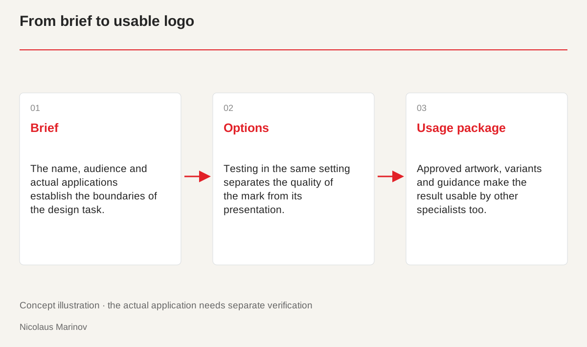
- Brief: The name, audience and actual applications establish the boundaries of the design task.
- Options: Testing in the same setting separates the quality of the mark from its presentation.
- Usage package: Approved artwork, variants and guidance make the result usable by other specialists too.
Turn the brief into a design direction
Before drawing a shape, clarify the name, the service and the important applications. A long company name may require a different solution from a short brand name. Business cards, mobile headers and packaging offer different amounts of space. Include a few desired qualities such as personal, precise or energetic, together with what you want to avoid. The designer uses these to develop a coherent direction rather than trying to squeeze a separate illustration of every adjective into the mark. A useful brief defines the problem without prematurely dictating the whole visual solution.
Compare concepts fairly
Review each option in the same applications and ask the same questions. Is the name readable? Does the mark remain distinctive in one colour? Does it suit the service? An elaborate embossed mockup can conceal weaknesses when another option is shown only on a white page. Neutral tests and realistic applications are therefore useful together. Make feedback specific too. Tight letter spacing or excessive detail can be addressed; “something is missing” gives less direction. A consistent comparison prevents the quality of a presentation from being confused with the quality of the logo itself.
Adaptation should preserve recognition
A long horizontal logo can have a compact application, provided their relationship remains clear. A tiny icon does not need the full name if identification is established elsewhere in the system. Light backgrounds, dark backgrounds, single-colour printing and small sizes each need a check. Variants do not justify stretching the mark or changing its proportions arbitrarily. Curves, fills and text treatment in the vector file should be organised properly. This allows later exports without introducing technical errors or accidental changes in form every time another medium is added to the business’s communication.
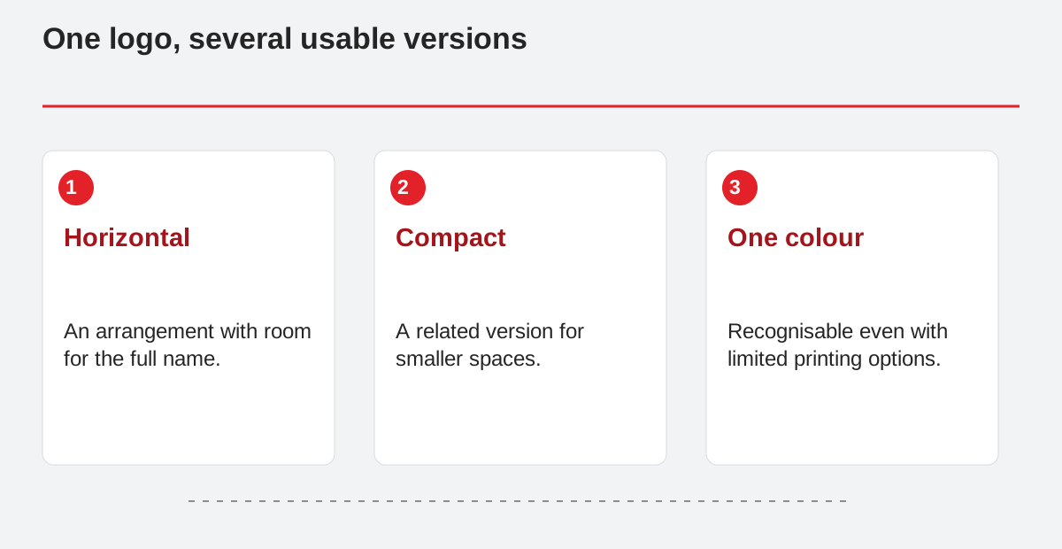
One logo, several usable versions.
- Horizontal: An arrangement with room for the full name.
- Compact: A related version for smaller spaces.
- One colour: Recognisable even with limited printing options.
Make the handover practical
Request short usage guidance and clear file names. A web export, print version and editable original serve different purposes. Record the colours, clear space and unsuitable situations. A new printer or developer should be able to work independently from this information. Ownership and usage conditions should also be clarified when the final design is approved. A polished presentation does not replace that discussion. Alongside recognition, a logo’s value comes from reliable use over time. An organised handover helps the company apply the identity rather than having to arrange another round of preparation immediately after the first launch.