

How identity design and a logo relate
Archived article with editorially revised content
A good logo can recall experiences associated with a brand, but it cannot replace the entire visual identity. It is the central mark; colour, typography, imagery and usage rules make the surrounding appearance consistent.
More than an emblem
The identity appears on business cards, websites, packaging and presentations. These applications should reflect the business’s values and communication. A considered system stays recognisable even when every item does not use the same layout. The logo is a starting point rather than the end of the design process.
Being distinctive is not about literal illustration
A logo does not have to depict the service directly. Apple’s mark is not a drawing of a computer. If every security company chooses a shield, telling them apart becomes difficult. An original idea, a distinctive wordmark or an unusual but justified form can be stronger than a cliché. Evaluate the proposal within the whole identity, at small sizes and in real applications.
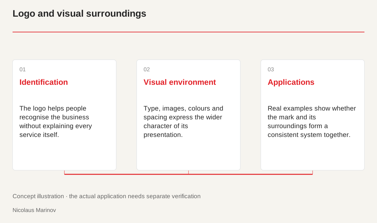
- Identification: The logo helps people recognise the business without explaining every service itself.
- Visual environment: Type, images, colours and spacing express the wider character of its presentation.
- Applications: Real examples show whether the mark and its surroundings form a consistent system together.
The mark and its surroundings work together
Imagine two business cards with the same logo. One has clear spacing, consistent typography and readable details. The other combines many colours with difficult information. They create different impressions even though the central mark is identical. Review the surrounding copy, palette and spacing when assessing a logo. The mark identifies the business, while its visual environment helps express its character. Connect these responsibilities rather than loading every communication requirement into one emblem. Applications often reveal more than an isolated logo view about whether the design genuinely supports the intended presentation.
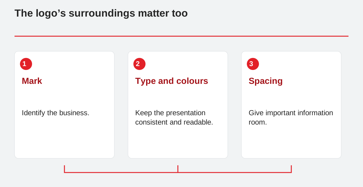
The logo’s surroundings matter too.
- Mark: Identify the business.
- Type and colours: Keep the presentation consistent and readable.
- Spacing: Give important information room.
Not every message belongs inside the logo
A long list of services or extended slogan can make a mark unreadable at small sizes. Additional information can appear in the website header, on the reverse of a business card or in introductory copy. The logo then remains more adaptable and memorable. For a consultancy, the name may identify the business while a separate readable line explains the specialism. This is deliberate hierarchy rather than lost information. A small icon and a full introduction do not require the same amount of text. Distribute information according to the encounter rather than forcing it all into the same shape.
Keep variants visibly connected
Establish shared principles for typography and imagery. There may not always be space for the full name, but a compact symbol and wordmark should remain related. Define colours by their roles instead of inventing a new palette for every format. Original photographs and consistent crops can also strengthen the relationship. Develop several applications alongside the logo. They reveal whether the identity works independently or only appears coherent inside a carefully arranged presentation. These trials also improve handover by giving other specialists concrete examples rather than relying entirely on abstract usage rules.
Development does not always mean replacement
An uncertain presentation may require changes to the surroundings rather than the central mark. Better website structure, clearer copy and organised document templates can preserve an already familiar logo. Full replacement becomes appropriate when the mark itself no longer works or does not suit the business’s direction. List what should stay separately from what needs to change. This avoids losing recognition unnecessarily. Treating the relationship between logo and identity deliberately can preserve valuable elements while creating a more usable presentation. Both aims belong to planning a functioning visual system.