

What might be wrong with your business identity?
Archived article with editorially revised content
A business can outgrow its previous appearance. A quickly designed launch logo, materials built from unrelated templates and years of small changes may eventually give an unclear impression of what you offer and who you work for.
Identify the real problem
An old or simple logo is not automatically a bad one. More useful questions are whether it is distinctive, usable at small sizes and applied consistently. Generic clip art, illegible lettering or a confusing resemblance to a competitor can cause problems. Trademark eligibility requires a separate assessment; an attractive design is not a legal guarantee.
Organise before you redesign
Review the website, social profiles, proposals and printed materials together. If the recognisable and valuable foundations are still sound, consistent colour, typography and usage rules may be enough. A complete identity change makes more sense when positioning, the target audience or the service has also changed. The decision should start with a business need rather than a desire for a fashionable new graphic.
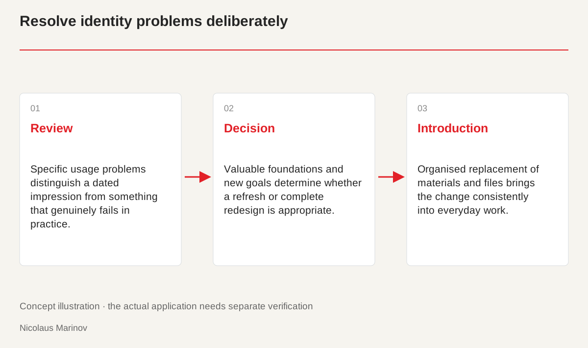
- Review: Specific usage problems distinguish a dated impression from something that genuinely fails in practice.
- Decision: Valuable foundations and new goals determine whether a refresh or complete redesign is appropriate.
- Introduction: Organised replacement of materials and files brings the change consistently into everyday work.
Separate the symptom from its cause
When a website looks dated, it is tempting to blame the logo. The real issue may be weak photography, copy that no longer describes the current service or too many inconsistent type sizes. Collect concrete examples. Instead of “not modern”, describe a name that becomes unreadable at small sizes, different profile images or a key button that is difficult to find. Those problems can receive targeted solutions. Accurate diagnosis prevents a useful logo from being replaced unnecessarily while the actual weakness remains. It also makes the discussion with a designer more constructive and helps establish priorities that everyone can understand.
Compare a few real applications
Review the mobile header, a printed proposal and the email signature together. Do they identify the same business? Are the contact details current, is there space around the logo and are colours consistent? A workshop might have outgrown the hobby-project atmosphere of its first website while its old mark remains recognisable. Stronger typography, new original photographs and clearer service descriptions could then offer more value than a complete name change. Practical observations from staff and customers can help. They reveal which materials cause genuine difficulty instead of limiting the review to one person’s visual preferences.
Refresh or redesign?
A refresh preserves a valuable foundation while correcting problems in its application. A full redesign explores a different direction, perhaps because the audience or service has changed. The cost and introduction process differ. Write down what should remain before deciding what must change. A new logo alone will not fix inconsistent customer communication. Connect the visual decision with website content, printed materials and the templates employees actually use. That makes the change visible and sustainable. Without this connection, a new design can soon develop the same weaknesses as the old system, however convincing it looked in the original presentation.
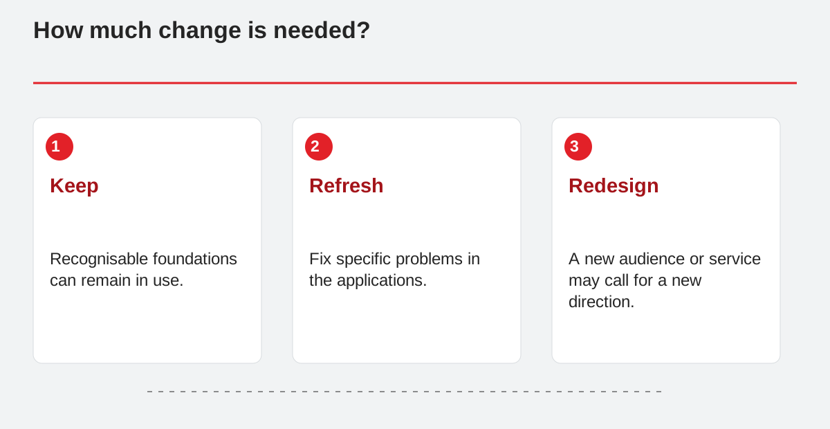
How much change is needed?
- Keep: Recognisable foundations can remain in use.
- Refresh: Fix specific problems in the applications.
- Redesign: A new audience or service may call for a new direction.
Plan how the changes will be introduced
The order of replacement matters. List the website, social profiles, document templates, signage and existing stock together with the person responsible for each. Usable printed materials do not automatically need to be discarded, but parallel versions should be handled deliberately. Separate archived files from current working versions. Finally, check whether contact details and logo variants genuinely match the new system. The improvement then extends beyond a striking presentation. It reduces everyday uncertainty and gives new colleagues a practical foundation for producing additional materials without repeatedly inventing their own versions of the identity.