

What makes a logo work on your new website?
Archived article with editorially revised content
A logo on a new website is rarely shown large and on its own. It needs to work in a narrow header, beside a mobile menu, as a small browser icon and against dark backgrounds. Designing it therefore requires specific use cases as well as an appealing presentation.
Include the applications from the start
Begin with a list: header, mobile navigation, profile image, proposal document and business card. Note the space available and typical background for each. A long horizontal logo might fit the website well but remain difficult to use as a square profile image.
The aim is not to create a different brand for every surface. You need a few considered versions of the same mark and name. Develop them together so the smaller version does not become an afterthought squeezed into a smaller space.
Reducing the size is a useful reality check
Try the symbol as a small browser icon and the complete logo in a real mobile header. Do the essential shapes survive? Do thin lines merge? Is the name readable? An intricate detail does not become practical simply because it looks good on a large presentation board.
For the fictional Fenyő woodworking studio, the lettermark and name can also be used separately. Packaging provides room for the full version; a small icon uses only the symbol. This is an illustrative design study, not a real client project or a finished logo available for download.
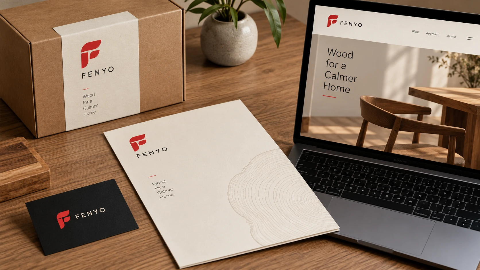
An application example: the mark's role depends on the medium and available space.
Establish the shape before adding effects
A black-and-white version helps reveal whether the mark remains understandable without gradients or extra effects. This does not rule out colour or detail. It shows what recognition depends on. Test light and dark backgrounds separately: one file does not automatically work on both.
Work with the actual name when choosing typography. The attractive proportions of a short sample word do not prove that a full business name will fit. Letter spacing and the distance between wordmark and symbol become especially noticeable at small sizes.
What should the handover include?
- An editable vector master and a web SVG version.
- The necessary raster exports with transparent backgrounds.
- Versions for light and dark surfaces.
- Clear space, minimum usage size and colour values.
- Information about fonts and usage.
Review the web SVG separately. It should not carry unnecessary editor data, external resources or redundant code. On the finished website, the logo link should lead to the homepage and have an understandable accessible name for screen-reader users.
The final test is practical use. Place the logo in the planned website header, check a narrow screen, and only then decide whether it needs more refinement.
Further reading
A related article: WEBújítás: Milyen a jó logó az új arculatodhoz?. This is an independent treatment focused on website use.