

What makes a good visual identity?
Archived article with editorially revised content
A good identity makes a business recognisable and supports everyday use. An effective symbol, well-chosen typography and a considered colour system are more valuable together than a collection of disconnected visual effects.
Recognisable, memorable and distinctive
The shape and name should create an easily identifiable connection. Being distinctive is not about being unusual for its own sake: it should express the business and suit its audience. Instead of chasing a short-lived trend, build lasting foundations that can evolve. A logo can be simple, provided that clear decisions sit behind that simplicity.
It should work in real applications
Test the design at small sizes, in one colour, against dark and light backgrounds, on screen and in print. Details should not disappear and lettering must remain readable. Suitable files and a short usage guide are as much a part of delivery as the visual proposal. As a designer, I use my experience to turn an idea into a working system rather than just an attractive image.
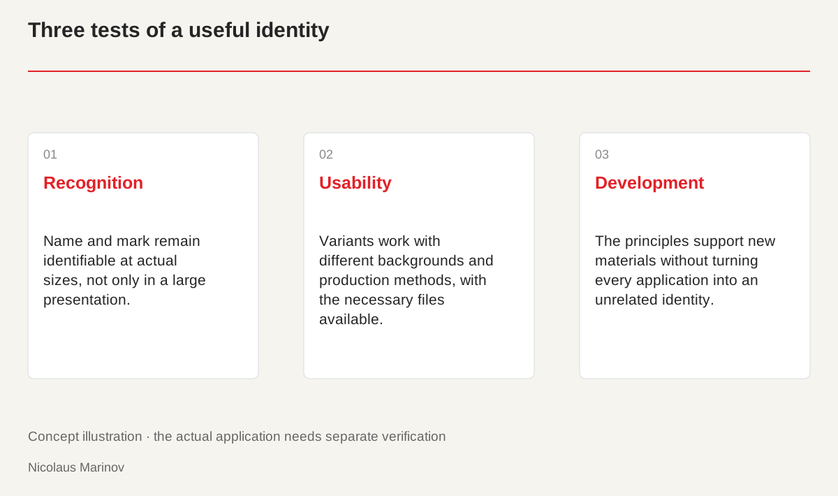
- Recognition: Name and mark remain identifiable at actual sizes, not only in a large presentation.
- Usability: Variants work with different backgrounds and production methods, with the necessary files available.
- Development: The principles support new materials without turning every application into an unrelated identity.
Test recognition in real use
Do not evaluate an identity only in a large presentation image. Show it at the sizes customers will encounter: a mobile header, business card and short document. Is the name recognisable, and does the mark stand apart from surrounding content? A complicated symbol can look impressive at a large scale but fall apart as a small profile image. An application test is not a public vote. It examines readability and usability rather than counting positive reactions to an image without context. Making that distinction helps the team base a visual decision on criteria they can explain and repeat.
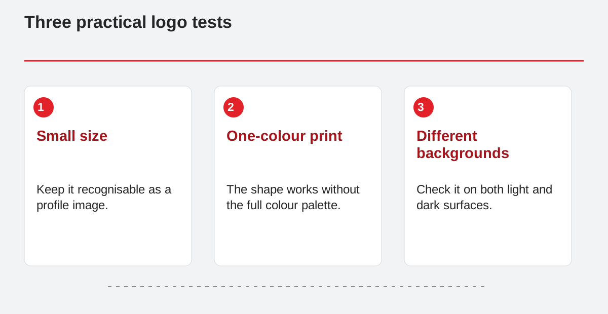
Three practical logo tests.
- Small size: Keep it recognisable as a profile image.
- One-colour print: The shape works without the full colour palette.
- Different backgrounds: Check it on both light and dark surfaces.
Combine individuality with clarity
A good system can include something unusual, but that element needs a purpose. A distinctive letter connection may help people remember a name, while a particular image crop can express the service’s character. If every component tries to surprise the viewer simultaneously, the identity becomes difficult to manage. Choose a clear emphasis and let the other parts support it. A professional consultancy, for instance, can feel confident and personal without adding a new decoration or loud colour to every page. A consistent foundation gives the content room. Individuality comes from how decisions work together, not from the number of visual effects.
Technical quality eventually becomes visible
Space around the logo, appropriate exports and clear type specifications are not minor details. If a typeface is missing when the file is reopened or only a low-resolution image remains, later materials suffer. Deliver an understandable package containing editable originals, versions for different backgrounds and digital exports. A single-colour version keeps the mark recognisable when a document or production method cannot support the full palette. Check these conditions during design. Other specialists should not have to improvise or unintentionally change the form simply to produce an everyday item the business needs.
Build a foundation that can develop
There is no need to design every future material in advance. Establish rules that allow a new product page, invitation or proposal to be created consistently. A useful trial is to design three very different applications: a small avatar, a longer document and a mobile page. If they remain related while each works well, the identity has genuine room to grow. Update its applications when necessary rather than automatically replacing the central mark. A good system also proves its value in how easily it handles new situations. It enables future work instead of turning every extension into another complete redesign.