

What are Pantone or PMS colours?
Archived article with editorially revised content
The Pantone Matching System supports consistent colour communication through defined samples and ink recipes. A spot colour may be applied as a separate ink, whereas CMYK colours are built from screened combinations of process inks.
A number cannot replace a sample
Interpret a colour code together with its system and material specification. Coated and uncoated paper can show the same ink differently. A screen preview is guidance, not a printing guarantee. Colour ranges also change, so an old colour count does not describe the entire current offering.
Discuss production in advance
For critical identity colours, use an appropriate physical sample and agree a proof with the printer. Not every shade is possible on every product with every process. Screen printing, pad printing and four-colour publications may require different preparation; spot-colour costs depend on the job. Include print and digital definitions in the identity guide and clearly explain possible differences.
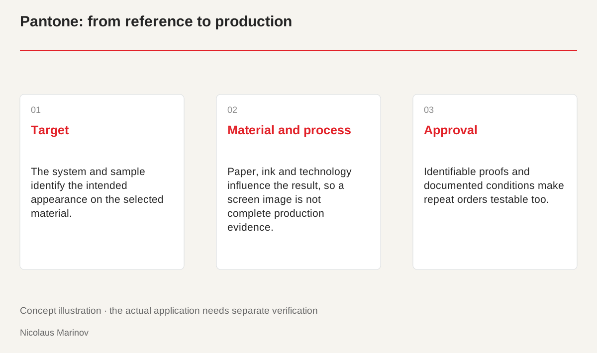
- Target: The system and sample identify the intended appearance on the selected material.
- Material and process: Paper, ink and technology influence the result, so a screen image is not complete production evidence.
- Approval: Identifiable proofs and documented conditions make repeat orders testable too.
A code provides shared language, not a guarantee
Naming a brand colour helps the designer and producer discuss the same target. The code does not describe every production condition, however. Paper, surface, ink and lighting remain part of the result. Do not replace the physical reference with a randomly found screen image. For each job, establish the relevant system and sample for the chosen material. Agreement is most helpful while the design can still change, not only when the finished print is delivered. A familiar colour name does not by itself establish a clear production reference that everyone has understood in the same way.
Coated and uncoated paper differ
In Pantone graphics samples, C and U identify appearance associated with different paper surfaces. The interaction between ink and paper affects what we see. A screen preview or sample for another surface therefore does not fully establish the expected result. Review the business card, packaging and publication on their intended materials. The identity guide should identify which definition belongs to each application. A new producer then avoids starting with a misunderstood version of the same code. This clarity also supports repeat orders and reproducing an outcome that was previously approved.
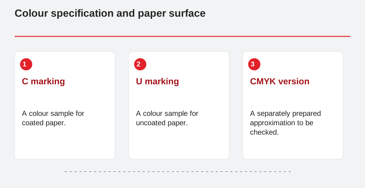
Colour specification and paper surface.
- C marking: A colour sample for coated paper.
- U marking: A colour sample for uncoated paper.
- CMYK version: A separately prepared approximation to be checked.
Spot colour and process versions
CMYK production may need an approximation of a selected spot colour. Accuracy varies between shades, and the alternatives require different preparation. Discuss whether a separate ink is necessary or process printing is sufficient. A short run and a longer production series may have different conditions. Do not promise an unavoidable match on every substrate. The decision should connect the colour’s importance, real use and an outcome that can be checked. A recognised colour system does not replace that judgement. It provides a shared reference that must be applied appropriately in the actual production workflow.
Record the handover clearly
Document the printing system, reference identification and purpose of the digital equivalent alongside the colour name. The approved proof or sample should be identifiable. Explain in advance when a shade can only be approximated on a material. Web values are not the same as an ink recipe. Check the conditions again for another production run, particularly with different paper or technology. The system then supports consistent work rather than promising to eliminate every variation. Clear documentation makes later decisions traceable and reduces misunderstandings that one isolated colour code cannot prevent.