

Website planning: from a first impression to a useful experience
Archived article with editorially revised content
A good website expresses a business’s character while helping visitors take the next step. The homepage should quickly explain what you offer, who you help and how to contact you. Visual design attracts attention; understandable content sustains it.
A distinctive appearance and a clear structure
A company history can be important without being the best opening message. Answer the visitor’s question first. A template can be a suitable technical starting point when adapted to the content; originality does not require writing everything from scratch. Images, typography and navigation should create a distinct character together, without unnecessary introductions or effects that obstruct the journey.
There is work after publication
Publishing is not a marketing strategy on its own. Provide helpful content, a discoverable structure, clear page titles and working contact options. Text, navigation and forms should also be usable on mobile. Start with a brief covering the objective, audience and available content. This makes a realistic plan and a clear proposal possible.
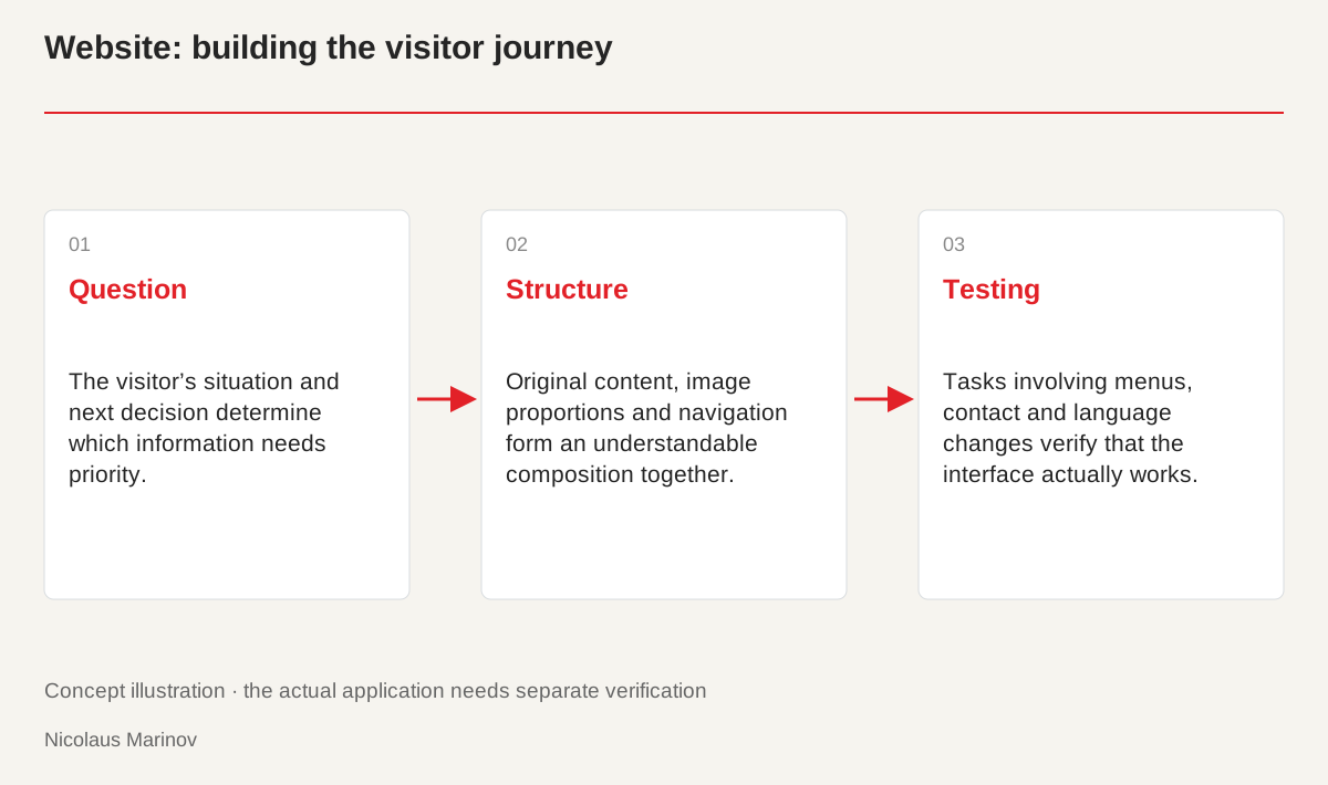
- Question: The visitor’s situation and next decision determine which information needs priority.
- Structure: Original content, image proportions and navigation form an understandable composition together.
- Testing: Tasks involving menus, contact and language changes verify that the interface actually works.
Design around the visitor’s journey
Start with the question that brings someone to the site. For a service, visitors may want to understand the offer, see previous work and learn how collaboration begins. This does not automatically require many menu items. Important information needs a recognisable place, and the next step should not be hidden. Support the main promise with evidence: original reference projects, a clear explanation of the process or a useful example. A short, organised page can provide more help than a long sequence of similar marketing blocks. The structure should support decisions rather than simply fill the available space.
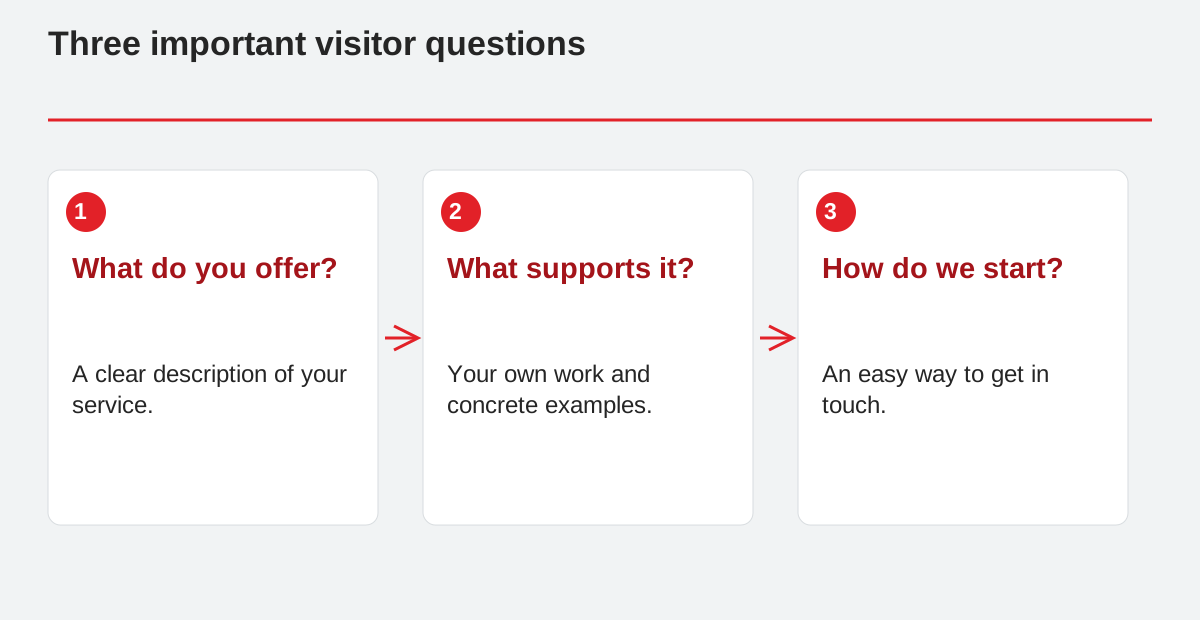
Three important visitor questions.
- What do you offer?: A clear description of your service.
- What supports it?: Your own work and concrete examples.
- How do we start?: An easy way to get in touch.
Establish content before refining the composition
Do not finalise the design around placeholder text. Gather the actual services, imagery and common questions. Mark missing materials clearly so responsibilities are understood. In an architecture portfolio, for example, image proportions and project descriptions influence the gallery structure. If copy arrives only just before launch, an attractive layout can easily become crowded. The content outline is therefore a foundation of design, not an attachment added to a finished interface. It also reveals which pages belong together and where an explanation is more valuable than another decorative area.
Interactions should help people navigate
Menus, search and contact features should work predictably. Information revealed by hovering over an image must also be available through touch and keyboard use. Animation can add character, but important copy should not remain invisible when reduced motion is enabled. Forms should explain errors and successful submission. Visitors also need to understand what happens to the details they provide. These small situations demonstrate design quality just as much as the large hero image. An attractive interface becomes a good website when its everyday behaviour maintains the same level of care.
Make launch a checked handover
Test internal links, contact details, the mobile menu and the form. Language versions should not mix labels, and important content needs clear titles. Arrange backups and an editor that supports safe future changes. Explain where copy and imagery can be edited, how updates are checked and who manages hosting. A good website is then more than a completed picture at launch. It becomes a sustainable communication tool that can develop with the business, without rebuilding the whole structure whenever a small piece of information changes.