
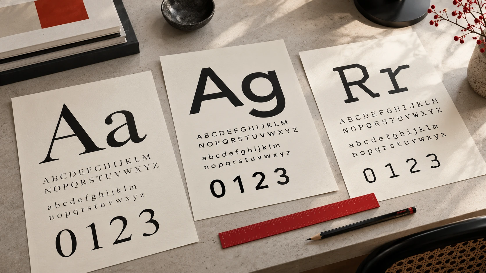
Timeless typography: choosing type for your identity
Archived article with editorially revised content
Timeless typography does not mean finding one universally safe font. It means choosing type that suits the identity, the text and the circumstances in which people read it. Something elegant on a cover can become difficult to read as a small mobile label.
Start with the job, not the name
List the places where the text will appear: a website, packaging, printed material or an app. Long paragraphs, short navigation labels and numerical information test different qualities. One useful family does not have to perform the same role everywhere.
Use real sample text. Hungarian needs characters such as ő and ű; German needs umlauts and ß. Try prices, neutral number sequences, brackets and longer words. These reveal missing characters and awkward details sooner than an attractive “Aa” specimen.
Classics provide starting points
Type in the Garamond or Baskerville tradition can suit text-led editorial work. Helvetica and Futura suggest other directions, from restrained to distinctly geometric. Names alone are not enough, though. Digital interpretations can differ in their drawing, weights and character coverage.
Compare two clearly different directions first, then investigate subtler differences. It is often easier to make a reasoned choice between two defined intentions than between ten nearly identical families.
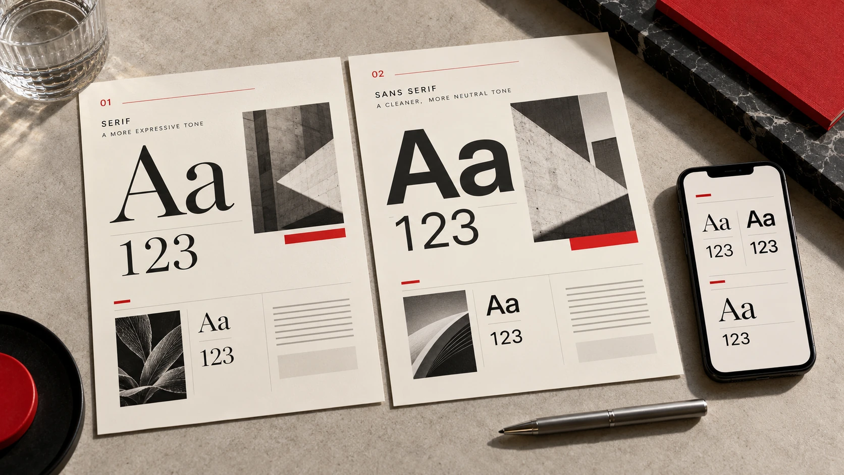
The illustration demonstrates typographic mood. Evaluate the actual cuts of a font family before choosing it.
Hierarchy matters more than variety
A display face and a readable text face are often enough. Establish the relationship between the main heading, subheadings, body text and captions first. If every element uses a different family, colour and weight, readers have to work harder to understand the order of information. Differences should have recognisable purposes.
Test line spacing and line length together. Increasing the font size does not necessarily fix an excessively wide text column. Thin lettering on a dark background, uppercase navigation and tightly spaced headlines all deserve individual checks.
Webfonts also consume resources
Load only the variants you need, and check the system fallback. Content should remain readable while the selected font loads. On a real mobile layout, observe whether switching fonts moves other elements. Review the usage terms and required language coverage before putting the family into use.
- Is the longest real heading still readable?
- Can readers distinguish I, l and 1?
- Do accents and emphasis work correctly?
- Do print and screen versions feel related?
A typographic decision does not become timeless by remaining unchanged forever. It lasts when its purpose can be explained and it supports the wider visual identity.
Further reading
For more classic families, see Just Creative: Timeless Fonts. This is an independent selection guide, not a translation of the source's font list.
Readable type specimens
These samples use system fonts rendered by your browser. The letters are real text rather than an image.
Georgia
Readable type, clear meaning · 0123456789
Arial
Readable type, clear meaning · 0123456789
Courier New
Readable type, clear meaning · 0123456789