

LYFE: a floating plant and considered product design
Archived article with editorially revised content
LYFE combines a floating planter with technology and nature-inspired product design. The original article introduced the concept during its 2016 crowdfunding phase. Prices, funding totals and delivery promises from that time are historical information, not current purchase terms.
A technical idea behind the visual effect
The polygonal container can float and rotate above a wooden base using a magnetic system. Gravity does not disappear; the system counterbalances the weight. As with Simon Morris’s FLYTE concept, unusual movement and a simple form attract attention together. The early presentation highlighted Tillandsia plants, for which ordinary potting soil is not the starting point.
Usability is part of design
A striking object works well when everyday care and operation are considered too. A plant is not just decoration: it needs light, water and suitable conditions. Follow the instructions for the chosen plant and the manufacturer’s safety guidance. From a design perspective, LYFE shows how one strong idea can create a memorable object without excessive ornament.
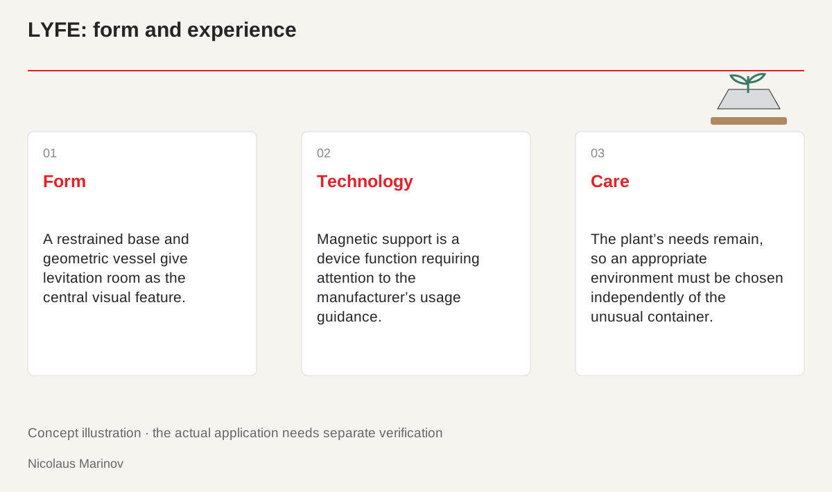
- Form: A restrained base and geometric vessel give levitation room as the central visual feature.
- Technology: Magnetic support is a device function requiring attention to the manufacturer’s usage guidance.
- Care: The plant’s needs remain, so an appropriate environment must be chosen independently of the unusual container.
A strong idea benefits from a quiet setting
Levitation already attracts attention, so the object’s form and surroundings can remain restrained. The space between the wooden base and geometric planter is part of the composition. Movement is not an added decoration here but the central product experience. Too many extra colours or patterns could distract from it. The same observation can inform a website: a distinctive feature needs room instead of every area moving or competing equally. Clear emphasis creates the effect. A deliberately quiet setting can communicate the special quality more convincingly than a presentation filled with unrelated visual effects.
Distinguish presentation from everyday use
A short product video can show an ideal arrangement. On a real desk, placement, access, cleaning and understandable instructions matter too. The levitating planter is a technical device, so its use and load should follow the manufacturer’s guidance. Choosing the plant is another task. Light, water and a suitable environment do not become unnecessary because the container looks unusual. Do not infer care benefits solely from the movement. Evaluate usability through actual tasks. An impressive film creates interest, but it does not replace the conditions or information needed to use the product in everyday life.
Presentation and everyday use.
- Presentation: A strong idea quickly attracts attention.
- Handling: Placement, access and cleaning matter too.
- Care: Consider the plant’s needs separately.
What can inform your own design project?
The lesson is not to make every product or identity levitate. Ask what the project’s one strong idea is and what helps people understand it. A product may have a distinctive opening method, while a service may have a clear visual story. Form, photography and wording should make that idea recognisable. Trying to communicate too many different themes simultaneously can bury the strongest detail. LYFE is useful as a design example rather than a universal formula. The transferable principle is to choose an understandable emphasis and support it coherently, not copy the visible mechanism without considering the new context.
Separate history from current product information
The original article referred to the crowdfunding period. Do not confuse that history with today’s prices, variants, availability or delivery promises. Check current details with the manufacturer, while reading the earlier story as part of the idea’s development. The new illustration is conceptual: it relates form, magnetic support and use, rather than serving as an engineering drawing or safety instruction. The object becomes a useful design example when handling and accurate communication are examined alongside its appearance. That allows the historical story to inform design without presenting old sales information as current terms.