

Lessons from Uber’s 2016 identity redesign
Archived article with editorially revised content
This article looks at the Uber identity introduced in 2016 as a historical example, not as the company’s current logo. That change offers useful questions to consider when an established service develops a new visual language.
The change is larger than a logo
The earlier thin wordmark was replaced with stronger lettering, while the application icon used a new symbol related to a grid structure. The design sought a character that was both technological and approachable. Local colours and patterns showed how a global system could leave room for its surroundings.
Recognition should be tested too
A new symbol can be carefully developed and still feel unfamiliar to existing users. A large presentation is not enough: app icons, small wordmarks, navigation and actual use cases matter too. Business outcomes cannot be attributed to the logo alone. For your own project, plan the objective, the recognisable elements to retain and the transition together.
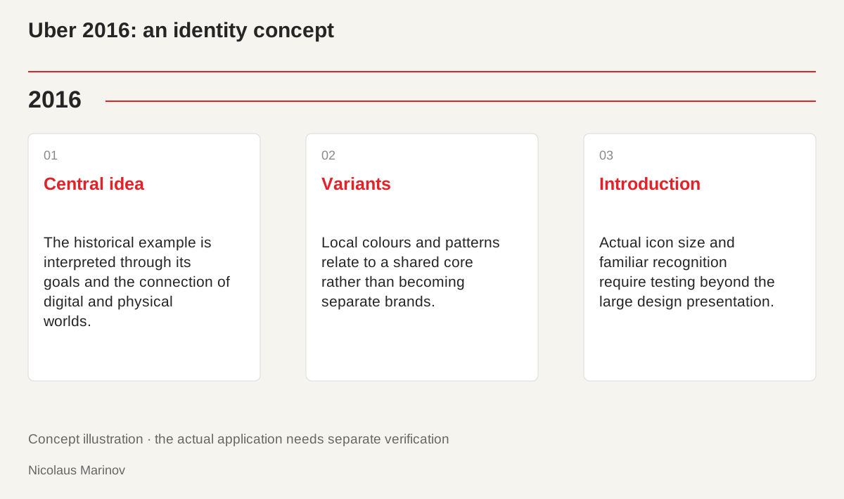
- Central idea: The historical example is interpreted through its goals and the connection of digital and physical worlds.
- Variants: Local colours and patterns relate to a shared core rather than becoming separate brands.
- Introduction: Actual icon size and familiar recognition require testing beyond the large design presentation.
Read the 2016 decision in its own context
The identity belonged to Uber’s story at that time. The company tried to connect the digital and physical worlds through a shared visual idea. The “bits and atoms” approach combined stable and variable elements in a global system. Its design challenge was to express a distinctive character while allowing local adaptation. Do not treat the historical presentation as today’s brand rules or begin the analysis with the current icon. The relevant questions concern the goals and conditions of that period. This makes the design an understandable example rather than a supposedly timeless template for every business.
Connect a common core with local variation
An international identity does not require every element to use identical colours and patterns. It needs a common basis for recognition. A smaller business can apply a similar principle to different product groups or services. The variable elements need defined roles, however, or the system may fragment into several miniature identities. Colour and pattern help when they establish a clear relationship. They should not appear merely because every new application wants to look more unusual. Design flexibility needs an understandable boundary so variation and belonging remain visible at the same time.
An app icon needs another kind of test
Details visible in a large presentation may disappear in a small icon. The mark appears among other applications, on different backgrounds and during quick decisions. Test it at actual size in a realistic setting. When introducing a new form, examine what remains familiar to existing users. Communication about the change is also part of the transition. A logical design explanation is not enough: people often do not read it before looking for their application. A functioning identity must account for that encounter rather than succeeding only inside the original design presentation.
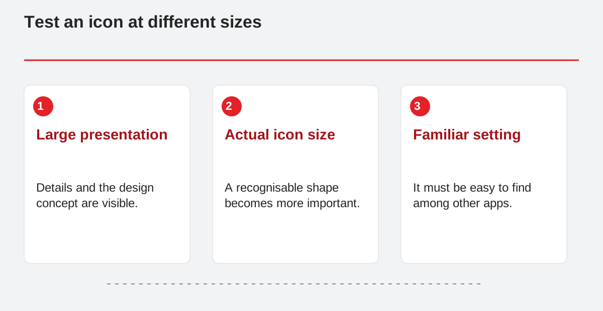
Test an icon at different sizes.
- Large presentation: Details and the design concept are visible.
- Actual icon size: A recognisable shape becomes more important.
- Familiar setting: It must be easy to find among other apps.
Apply the lesson to your own project
Before changing an identity, describe the reason, the elements worth preserving and the order of introduction. Prepare trials for mobile, web and print. Do not judge recognition solely through internal taste, and do not automatically attribute business results to the visual change. A strong system also supports future materials. Uber’s history is therefore not a logo shape to copy but an example of how a central idea, use and introduction relate. The new diagram illustrates those relationships rather than reproducing original trademarks. It helps discuss the principle independently of one particular visual solution.